Experts concur that from a marketing perspective, a restaurant’s menu is its most important sales tool. To that end, there is plenty of research proving a direct correlation between increased profit, by a margin of between 10 and 15 percent, and a well-designed menu. Heeding the following key elements will help restauranteurs to maximize the 100 seconds customers spend on average scanning an entire menu
Visuals
As the saying goes, a picture paints a thousand words and in this particular case, pictures add value. For these to achieve the desired effect, the visuals should convey emotion, whet the appetite and offer guests a clearer notion of what to expect. However, incorporating too many images will have a negative effect, which is why experts recommend keeping the number to a maximum of two per page.
Currency
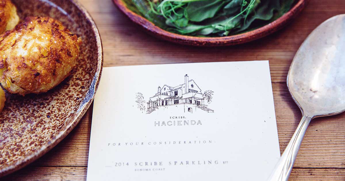
The practice of eliminating currency signs is highly encouraged as this drives customers to subconsciously shift their focus to the actual menu items which, in turn, reduces anxiety. Placing prices at the end of the description of each item, rather than to the far right-hand side, is also advisable, since it discourages customers from making comparisons. Prices that end with a number other than zero are interpreted as friendly and inviting, according to research. Including what is known in the industry as a ‘decoy’, namely an exuberantly-priced item close to the top of the menu which, in turn, makes other items appear more reasonably priced, is another strategy.
Language
Using softer adjectives, such as replacing the word ‘fried’ with the word ‘crispy’, make items more desirable and can help customers to feel less guilty about ordering food containing more calories. In addition, detailed descriptions have been shown to increase sales, as customers sub-consciously feel they are getting more value for their money. One other strategy is to place dishes the chef would like to promote in separate boxes on the menu, coupled with imaginative, enticing descriptions. Statistics confirm that this last strategy has been proven to raise customer interest and drive curiosity.
Space
One theory holds that when scanning a menu, our eyes follow a natural path, which makes item arrangement paramount. Psychologists believe that the eyes move from the center to the top right first, then to the top left of the menu, a space commonly referred to as the ‘Golden Triangle’. To gain optimal effect, it’s therefore advisable to position the most requested items at the top right of the menu, the limited/seasonal items in the middle and reserve the top left side for entrees and appetizers.
Choice
When it comes to the number of items listed, it is highly recommended to offer no more than seven choices in each category, especially when it comes to fine dining restaurants. This decreases anxiety and instills a higher sense of quality-to-value ratio in the offering.
Icons
These visuals have shown to have a highly effective impact on indirectly assisting customers in learning more about an item in the shortest space of time. A bracketing system can act as a similar tool, offering the same item in different sizes, helping customers to calculate prices and allowing them the satisfaction of feeling that they have identified a good deal.
Origin
Today’s consumers expect to know where products come from and also how they’ve have been produced. Including this information can be an effective tool in meeting these requirements, while providing a valuable opportunity to increase demand.
Digital menus
In an era when a customer’s first encounter with a new restaurant ahead of trying it out invariably happens online, having a visually appealing and clearly mapped menu is key. This menu should also automatically resize itself to fit any electronic display for optimal appeal.


